Contrasts of Starkness and Maximalism: EP Yaying by Franklin Azzi Architecture.
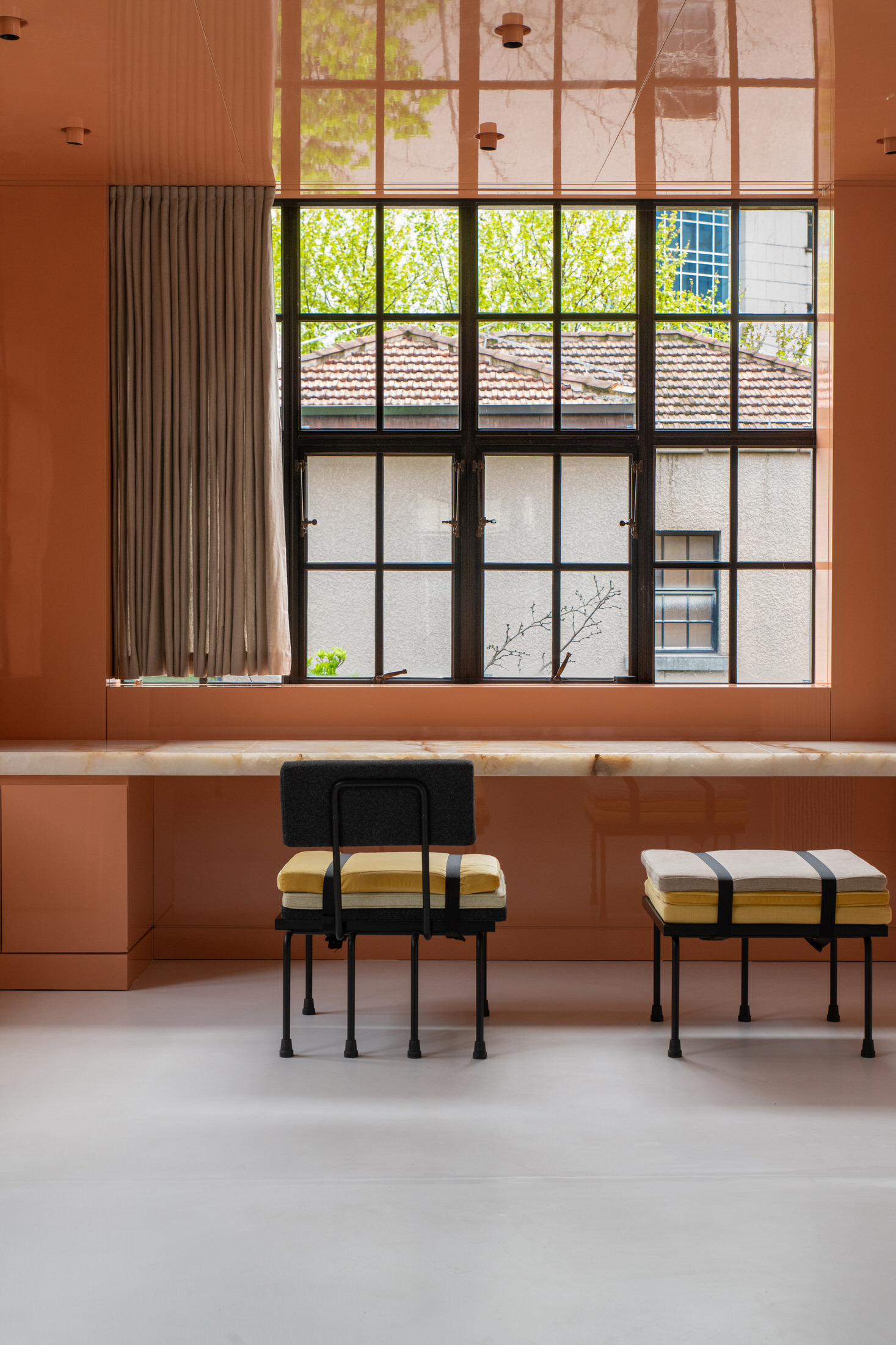
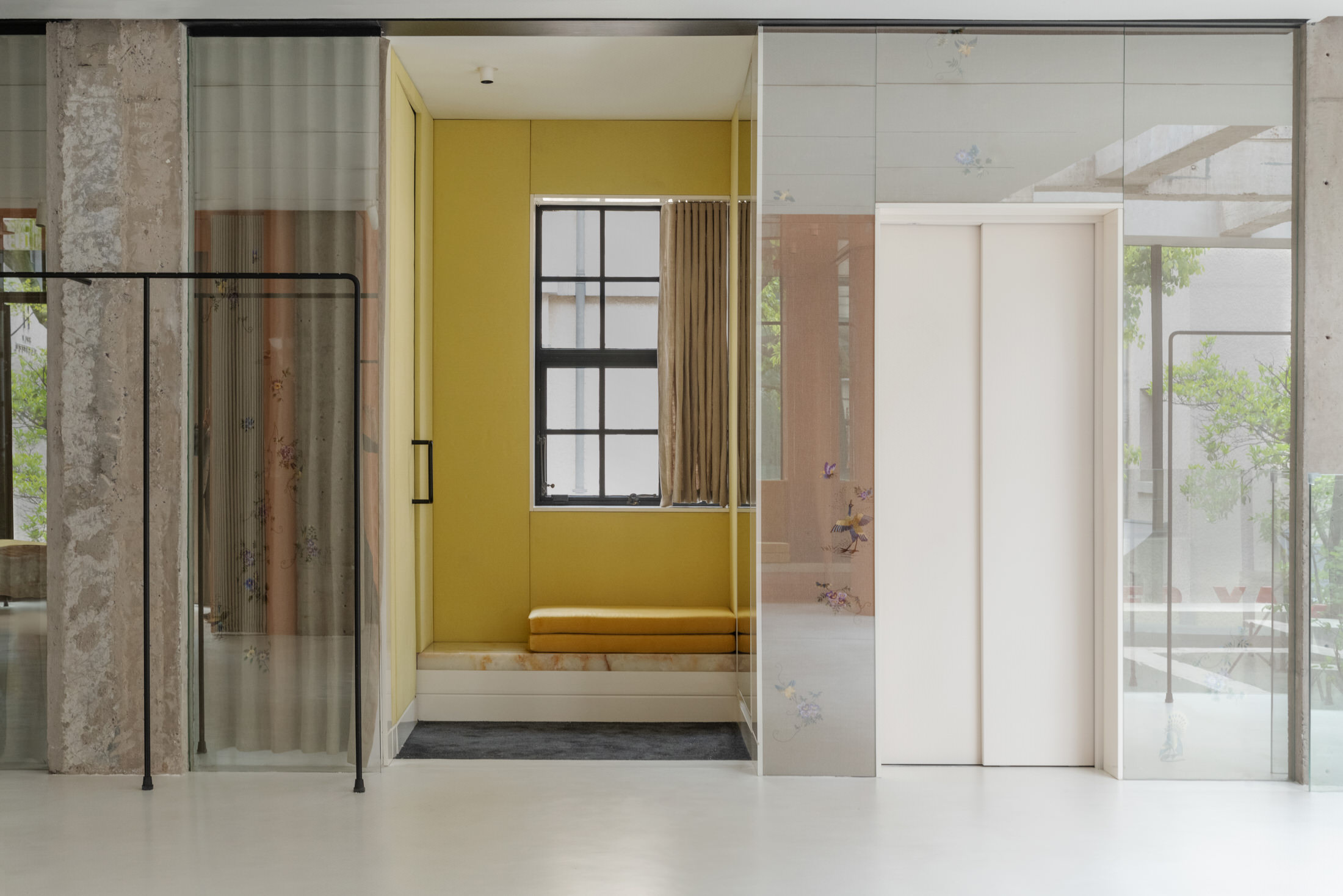
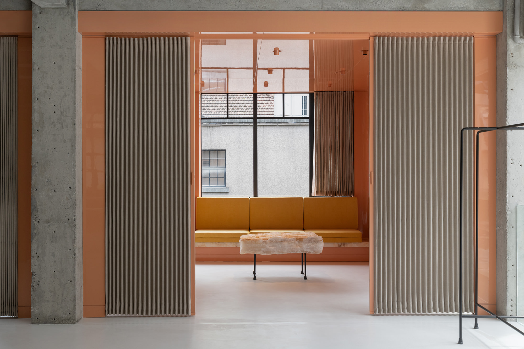
EP Yaying, translating to ‘pledge of quality’, is a brand that blends Chinese heritage with modern aesthetics through high-quality craftsmanship. So there’s no reason that the concept for all their future stores should be any different. Reaching out to the collaborative duo Franklin Azzi and Serge Reffieux, Chinese ready-to-wear label are now armed with a new architecture for all their future boutiques.
Taking an old colonial house in Shanghai and renovating it entirely, the new EP Yaying boutique boasts an architecture that favours transparency, a connection to the outside, and the integration of nature into all its elements.


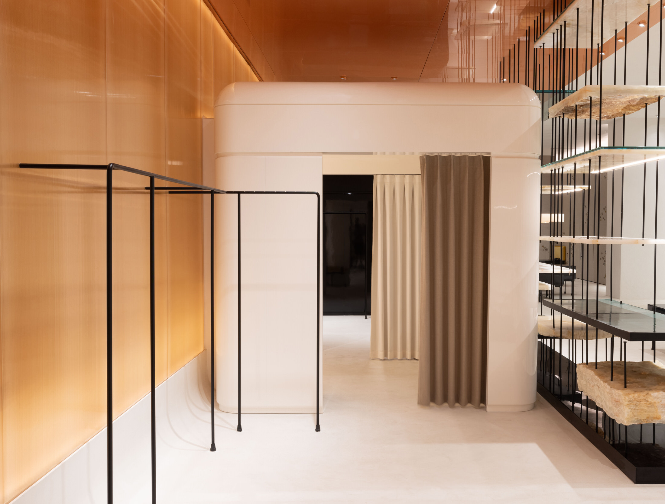

 The modular furniture scheme by Franklin Azzi Architecture.
Organic materials such as jade and stone are utilised in both their polished and raw forms. Unfinished edging to stone shelving introduce a sense of tactility and roughness into the otherwise structured and ordered space. Juicy lacquered joinery used in masses is the exciting juxtaposition needed to take this space from serious and mature, to enticing and rich. The materiality approach is a clever play on Chinese craftmanship, which, as Franklin Azzi describes as “built off the mixing of materials to reveal a play of contrasts between starkness, simplicity and maximalism”.
Creating an interior landscape, the spatial layout is deliberate and ordered. It is intended to allow the various zones within the boutique to merge with more public breakout spaces such as the courtyards and lounge areas. Quadrants with denser display shelving are connected to other spaces via corridors lined with glazed walls. Change rooms are contained within high gloss boxes, resembling an object that has been placed within a space. Designed with exhibition areas in mind, the furniture selections and lighting lend themselves to creating a sophisticated atmosphere that celebrates the product just as much as the space itself.
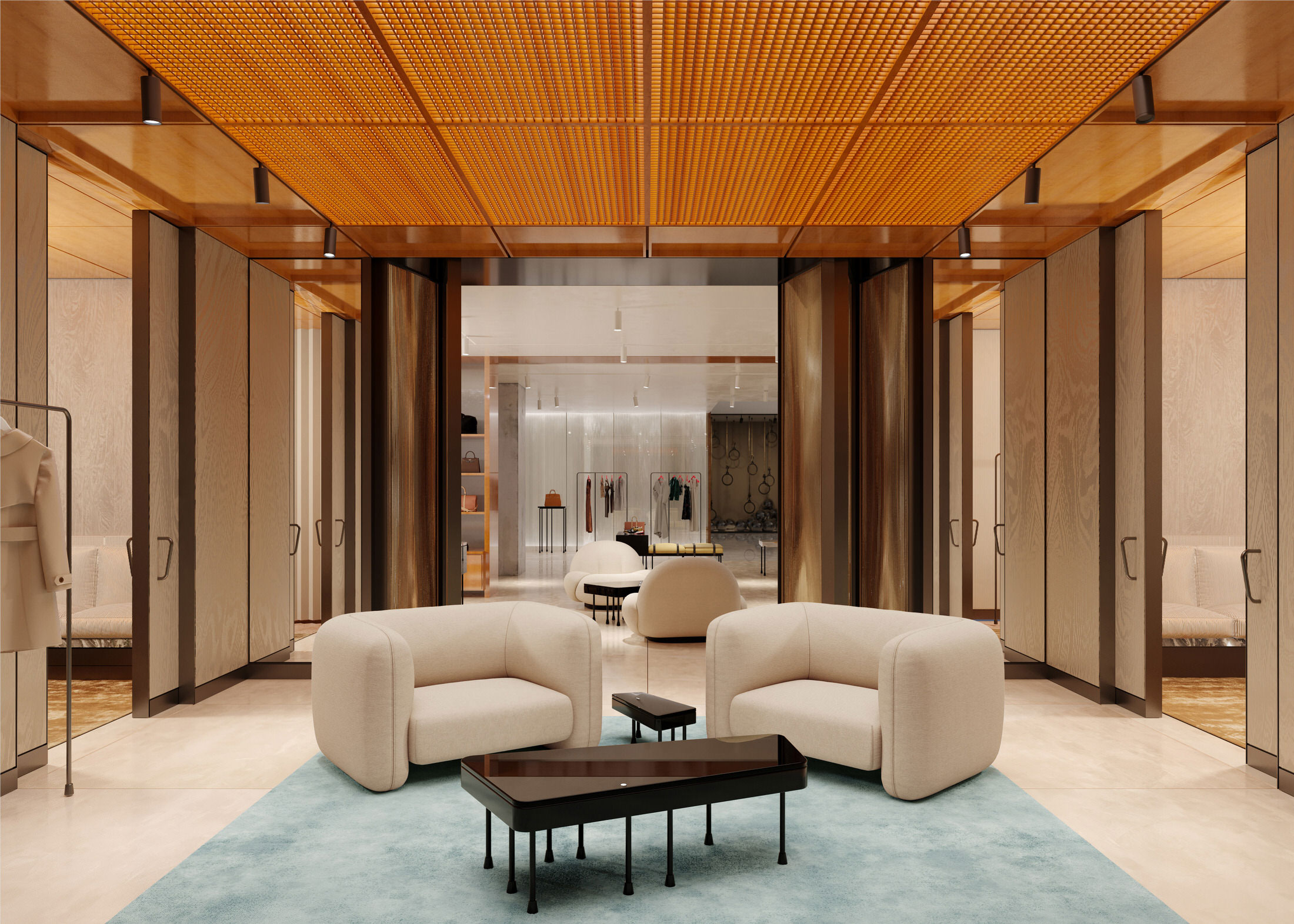 Franklin Azzi designed the concept to be rolled out in EP Yaying stores across china, such as this location.


With a background in various types of projects, Franklin Azzi is known for his commitment through both the large scale down to the smallest detail. Through his rooftop pavilion for Galeries Lafayette, he developed demountable mobile structures. For EP Yaying, he developed a series of seating elements, in cohesion with the fitout. Taking the black rods from the store’s shelving and hanging systems, Franklin Azzi designed them into stools, benches, chairs, display plinths and even angled mirrored displays for shoppers to check out the shoes they’re trying on. Found scattered across various areas of this three storey store, they are a cohesive element that are the perfect finishing touch.
[Images courtesy of Franklin Azzi Architecture. Photography by Matjaz Tancic.]


